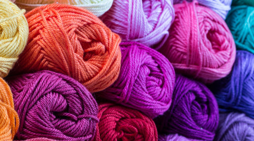
Create your dreams with our collection ♥

Ever start a knitting craft project you were really excited about, only to realize that despite all the yarn you have, the colors just weren’t working together? Or, maybe the finished piece didn’t quite give off the vibe you were going for after that last stitch or weave?
In knitting, color is texture’s partner. Your stitches create structure; your colors create atmosphere. The same lace pattern can look delicate and romantic in soft neutrals or bold, and modern in saturated primaries. A cabled sweater can feel grounded in forest greens, or adventurous in icy blues.
In this post, we’re diving into some of the science and psychology behind color choices—and how understanding them can help you bring your creative vision to life, one strand at a time.
Knitting Together the Color Spectrum.
Before getting to that next knitting project, there is one concept that will be most helpful to consider: Color theory.
Color theory is as much of a science as it is an art. The reason why we perceive certain color combinations to be more favorable than others is often thought to be a personal preference, but beneath every decision is a deep psychological mechanism at work.
Have you ever felt calm staring up at a clear blue sky? Ever felt nervous or excited looking at advertisements which heavily feature red?
There’s a reason for this, and without getting too scientific on the technicalities – it’s all about the brain and how it perceives color. Through ancestry and human evolution, we’ve evolved to subconsciously decipher the various meanings of color. In our crafts we can use this to our advantage to bring forth wild creations we maybe had otherwise thought impossible.
🎨 Why It Works:
When placed side-by-side, complementary colors amplify each other. This is because they stimulate different types of cone cells in your eyes, creating a vibrant "pop" that’s hard to ignore. It’s the reason orange embroidery on a navy background glows, or why a touch of lime green against burgundy feels electric.
Below is a color chart indicating positive relations between colors and their neighbors. This can often be referred to as Primary Colors (Red, Blue, Yellow). The colors marked by the arrows make up what are known as Complimentary Colors – Which are the colors opposite one another that allow for the most contrast and harmony when combined.

By understanding what our primaries are and their complementary cousins, we’ll be able to knit up a storm of possibilities! But here’s the key: complementary colors are powerful, so a little contrast can go a long way.
Let’s break it down with real-world examples you can use in your next creation.
1.
Complementary Colors: High Contrast with High Impact
This duo softens the classic blue/orange contrast into something more sophisticated and wearable. It's great for fall projects, accessories, or anything inspired by natural landscapes - like autumn skies or desert sunsets.
🧶 Try This Palette:
Burnt Orange (warm, rich, earthy)
Slate Blue (cool, muted, stormy)
🧶 Project idea: A color-blocked cardigan or geometric blanket with these tones makes for a bold but balanced statement. Keep one color dominant and use the others as accents for best results.
2.
Analogous Colors: Calm, Cohesive, and Natural
Analogous colors sit next to each other on the color wheel and create a soothing, harmonious effect. Think of them as neighbors that always get along.
🧶 Try this palette:
Sage green
Dusty mint
Muted teal
🧶 Project idea: A lightweight spring wrap or baby blanket using a soft fade of these colors will feel fresh and peaceful - perfect for nature-inspired designs.
3.
Neutral + Pop: Classic with a Twist
Neutral tones ground your work, while one vivid color creates a focal point. This is a great strategy if you want to play with color without going all in.
🧶 Try this palette:
Warm grey
Cream
Poppy red
🧶 Project idea: A striped cowl or hat that uses neutrals for the base with bursts of red in the pattern for a modern, wearable piece.
Final Thoughts: Let Color Tell Your Story
You don’t need to be an artist or designer to curate beautiful color combinations. You just need a little knowledge, a bit of practice, and the freedom to explore. Color theory gives you the tools to do it with purpose, turning a ball of yarn into a visual language. So next time you stand in front of a shelf of skeins (or scroll through your stash), take a moment to imagine not just what you want to make, but what you want it to say.
Curated Color Packs: A Shortcut to Inspired Knitting
Ready to put your color confidence into action? We’ve taken the guesswork out of pairing by curating yarn shade and variety packs that are designed with color theory in mind. Whether you're looking for complementary contrasts, soothing analogs, or playful triads, these thoughtfully assembled bundles are perfect for trying out the techniques from this post.
Each pack is more than just a pretty collection - it’s a ready-made palette that helps you jump straight from inspiration to creation. So go ahead and explore our color packs and start curating your next creative occasion with ease and intention!